What marketers experience in the digital game today is a constant evolving rule-changer and adaptation “Tom & Jerry” game.
Officially, we live at the peak of the information era, with over one trillion pages on the Internet. Let me put it in numbers — 1,000,000,000,000 pages.
“Every two days we create as much information as we did from the dawn of civilisation up until 2003” – Eric Schmidt, former CEO Google
For consumers it is absolutely amazing to be one-click away from any kind of information. But for content creators and marketers, there’s one sweet question in this game: how do you stand out?
Picture worth a thousand words or love at first sight are this game’s rules — you have to stand out with your visual imagery in order to stay alive. Auto-play videos on Facebook, the double-tap equal heart on Instagram and the Pin button that asks to be hit — the visual-centric channels are in the game and they’re here to stay.
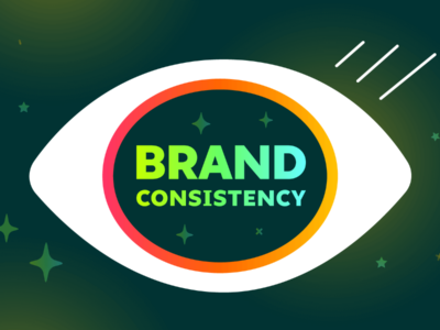
So, how does one brand is different, outstanding and eye-catching in a mass of so much information, but still be true to itself?
One simple answer — the magical Brand Identity Book.
To help you understand what I’m talking about, I want to quote Alina Wheeler:
Brand is the promise, the big idea, the expectation that reside in each customer’s mind about a product, service or company. Branding is about making an emotional connection.
In the next several steps, you’ll be learning to start listening what language is your brand speaking – in terms of colour, fonts, imagery, so that you could bring its spirit right into your banner ads.
1. No One Does It Alone — Your Brand Lives through Your Team

Both in branding and in life; both in marketing and in business — best ideas are mastered in a team. You have an immense resource of finding the soul of your brand — the people around you, those present from the beginning and those that embarked during the race.
The team working behind a brand is like the orchestra at the opera — it is one level below, you cannot really see it, but you hear the music they produce. Your team is singing the symphony, even if your customers cannot see it — what you can do is let this team to put the blueprint on the brand.
Your team believes in your brand and work for its success, and they are your first-hand ambassadors. Let them set the tone, because the more real and representative the brand is — the more your audience relates to it.
2. Same Visuals, Same Goals – One Language

Whether it’s the colours of the dining space of your company, or the colours in your banner ads or of your website — it’s all about your brand. And the Brand Identity Book helps you spread effortlessly this spirit.
Your content writers and copywriters follow the creativity spike, but visuals work differently, for a visual imagery style is easier to distinguish than a writing style. Images are easy to consume, but their impact is worth… one thousand Likes or Conversions.
Based on your Brand Identity Book, you have a guideline in matter of colours, fonts, images, design elements and layouts that you can bring in the conversation on your social media channels.
For example, when you hire a web designer – and we all know the creatives have their own style to manage the jobs. Picture this: you hire 3 designers in one year, and you don’t have a Brand Identity Book. How are they going to follow the spirit of the brand when they stay so little with you?
3. Online Love story — from the Brand Identity Book to your Banners

The visuals are processed 60,000 times faster than text, so your banners, both sponsored and in-house, should tell one thing to your audiences — you already know me and you trust me and I’m the right choice to make. Instant recognition and credibility is achieved by keeping a consistent trend in designing all your visuals according to your magical book.
Give a direction to your visuals and over the time they will bring meaning, which is rarely immediate and evolves over time, but when achieved, it brings a sense of consistency and loyalty.
Let’s take Sponsored Ad campaigns
When you’re running one on Facebook, Instagram, Google AdWords or Twitter, you want to be as appealing as possible so your audiences indeed click on them. Perfect scenario: your audiences convert. But what if by clicking your ad they land on a page that visually is not coordinated with your ad? What if the colours, font and the patterns don’t follow the same style and your possible customer left the page because he didn’t feel safe?
Designing both your ads and your website or Landing Page in accordance to your Brand Identity Book gives your audiences a sense of security and trustworthiness.
In-house banners
The banners and headers that you have incorporated on your website or blog should be, by default, in harmony with the design of the page they are displayed on, because they are there during your whole campaign.
The use of your banner can be promoting a webinar, your services or being a reminder for an upcoming event — the goal is to do a conversion. So, you have to keep in mind two aspects and find the silver line between how to make your banner stand out, but also stick to the Brand Identity Book.
What to look for in order to make your ads compelling? Take this 4 step essential and focus on your logo, colour palette, imagery and font:
A. LOGO
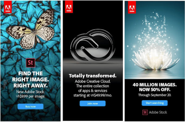
Your logo should be present in the banners, for audiences should know whose banner they see. Adobe predefined in the Branding Book how the logo is going to appear in banners both online and offline — the red logo should be a piece of colour that would not be in conflict with any of the elements of the banner. Also, Adobe is making its logo so out-of-banner that is creating a pattern which gives trustworthiness to its content.
The supreme goal — to immediately recognise Adobe and actually be alarmed when there’s a banner marketing for Adobe, but it doesn’t have the red logo.
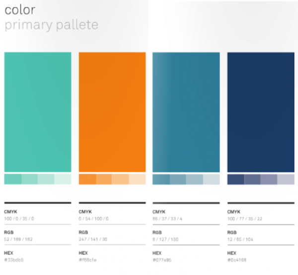
B. COLOR PALETTE
Colours are the ones that can make your banner stand out, and, at the same time, the ones who can cut your banner’s life. So that you don’t have the tendency to apply the colours of the rainbow, give it a try and see how you can gracefully combine them.
I found this infographic by Johnny Toaster and this one from Bright Side, whichever helps you best — as long as your outcome is visually pleasing and persuasive, give it a go and experiment.
One study has found that up to 90% of the snap judgements made about products are based on the colour — depending on its alliance with the brand spirit.
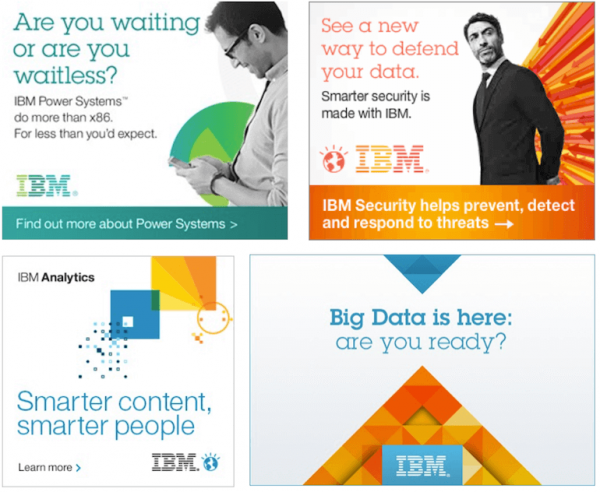
Have some inspiration from IBM, as they use complementary colours in their Brand Identity Book and focus their ads around those colours:
Using complementary colours in your ads is easy because you can play with the shades of one colour and also combine two colours with different shades . For IBM it works both way, as they use colours from the Brand Identity Book, but they still play with the nuances and combinations:
Sprout Social, on the other hand, uses a green palette completed with white and black, a pattern they also transcript into their banner ads:
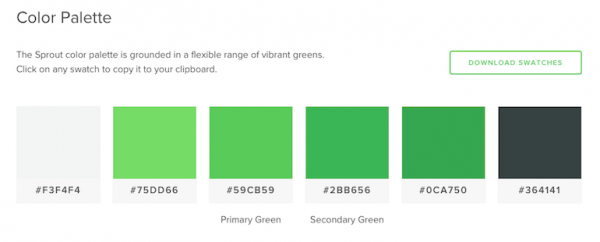
The brand assets are an important guideline for Sprout Social – from graphic images, to static compositions, the company tries to fall in the specific colour palette.

C. IMAGERY
As a part of your background, you can choose an image, without limiting yourself just to a picture. It can be a simple combination of geometrical forms just like some of Sprout Social’s banners.
Whatever you choose, think first about the message you want to convey and only then choose the one image that fits you the best.
It is up to you what image you should use, as long as it is defined in your Brand Book what kind of reaction you want to generate and if it projects your brand’s spirit — go for it!
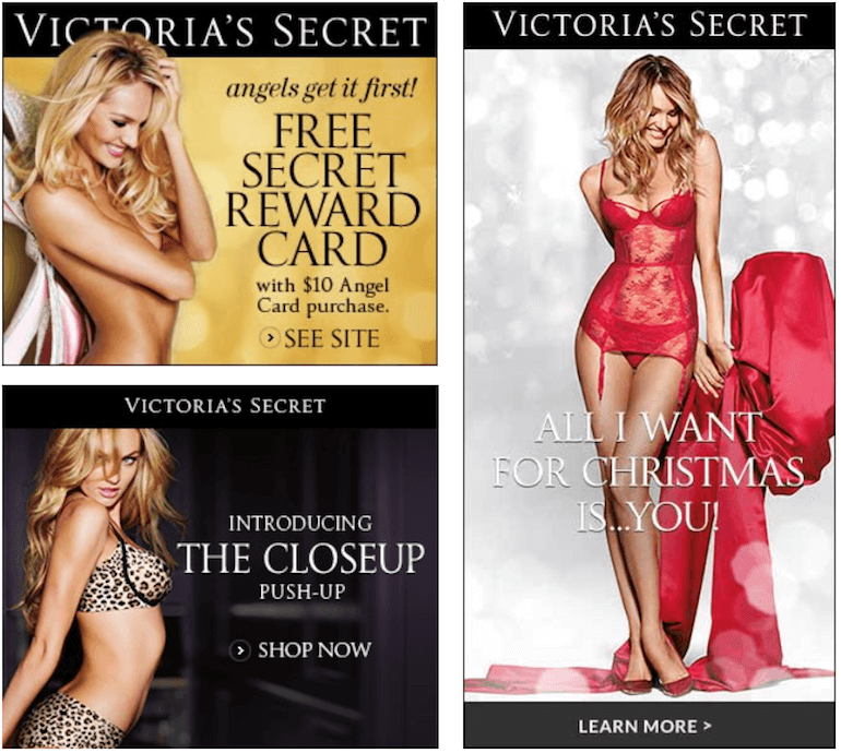
Victoria’s Secret banner ads are easily recognised from a million thanks to the presence of the Victoria’s Angels both in print, stores, fashion shows and on online banner ads. A funny fact is that VS designers can even cover the logo with the model on the banner, because the image of their Angels are so deeply associated with the brand, the audiences already know who’s company ad they see.
Victoria’s Secret is an experience from the Victorian style stores to the unmistakable style of the banner, all played around lusty colours like pink, red, purple, green, gold and black:
D. FONT
One important aspect of your branding is the fonts you’re using to create both your logo and your ads. Pretty much in every Brand Identity Book, typography is given a whole chapter, because the right font makes your brand stand out and be more recognisable.
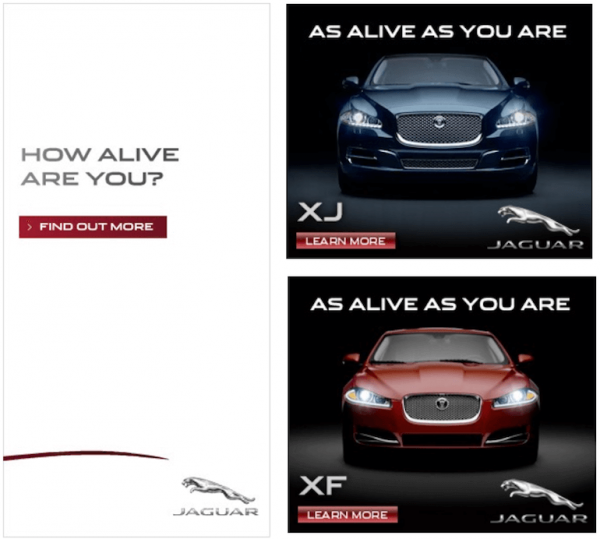
Let’s take the font used by the car company Jaguar – Jaguar Bold and Jaguar Regular.
Starting from the brand name on the cars to the advertisement and any other kind of communication with their audiences, the company is faithful to one supreme font. Why? Because it’s a simple and edgy font that talks Jaguar language, which speaks for the brand alone:
Conclusion
Of course, there are some other aspects from the Brand Identity Book that should be taken into account, but when talking about banners — these four are the main points to pay attention.
Building the Brand Identity Book is a journey of both discovering your own baby and its potential, but also to determine the language you’ll speak to your audiences.
Check your logo, the colours that represent you the most, what font brings your message forward and what images depict your brand feelings and start writing your Brand Identity Book today!