It is not a secret that it is impossible to make any business successful without a well-thought and effective marketing campaign.
It helps a company either to enter the market or enhance its market position. There are various tools that are used to achieve the objectives set by the business. For instance, different types of media can be involved in the process, such as print media, social media, television, search engines, and, of course, direct mail.
Email marketing is considered to be one of the most powerful marketing tools.
There are several reasons for this. First of all, it is personal and targeted, as you address potential customers and they are likely to respond to your offer if it meets their needs. Moreover, by using it, you have an opportunity to check whether your campaign is successful or not.
For example, it is possible to track the number of emails sent and the amount of requests that have been generated by them. In order to increase the number of requests, it is not just enough to follow a certain structure and describe your offer. It is worth taking into account the design of an email and, what is more important, the design of a call-to-action button (CTA).
Why is CTA so significant?
It is the CTA button that makes your audience take a corresponding action. Do you want people to purchase a product, download some materials, or find out more about your services on your website? This is the direct function of the CTA button.
The more people click on it, the higher the conversion rate is.
CTA should be designed properly to attract attention and convert.
It is possible to do everything yourself. However, if you are not sure what design you need for your email, it is advisable to use ready-made newsletter templates. It will certainly facilitate the task of creating an effective email.
Moreover, the templates have all the necessary features that are sure to generate the most subscriptions and enlarge the number of follow-up requests.
Let us look at the points one should take into consideration to design a CTA that converts.
SIDENOTE: If you are interested in how to do a great email outreach, you should read this article.
1. It is Advisable to Create a Button
CTA can take several forms. For instance, it can be a simple hyperlinked text or a button. It is better to use a button rather than a hyperlink, as in most cases it encourages people to press it automatically. Thus, it may contribute to increasing the click-through rates and, as a result, the conversion rate, as well. It is possible to make an HTML button or an image-based one.
However, the image-based buttons may not be so effective if people disable images in their email. In this case, they will not see them at all. Therefore, it is worth opting for the HTML5, as they are likely to be noticed by the recipients.
Moreover, it is easier to make them attract attention by choosing the appropriate shape or color.

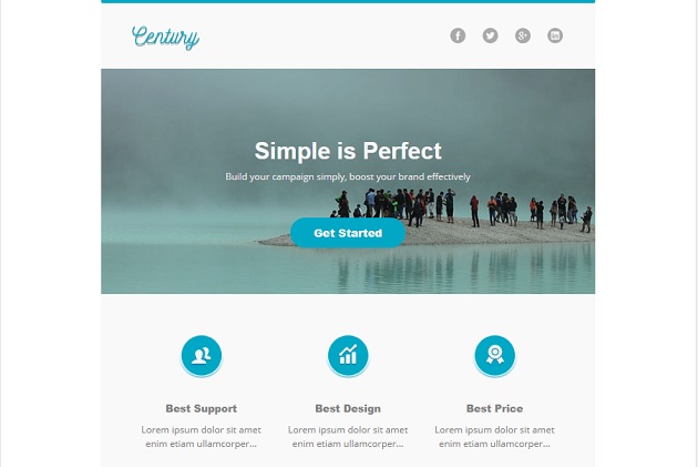
An elegant Century Email Newsletter Template is one of the outstanding templates that has a CTA designed as an HTML button.
Using it, you will definitely create absolutely unique emails. As a result, it will increase the conversion rate and improve the productivity of your company.
2. Color is the Key
It is well known that colors are used not only to attract attention but also to evoke certain emotions. Therefore, it is recommended to take it into account while designing the CTA button. The color should make the button visible and single it out from the rest of the email content. It is also possible to opt for the colors that match the brand you are promoting. Moreover, don’t forget about the effect of the white space around the CTA button.
It is better to avoid cluttering the area around it and just leave it white. In this case, there are more chances that the button will be noticed and pressed.
If you are looking for an example of how to do it properly, here is a Responsive Email Newsletter Template TopShop. Notice the red color of the CTA button that is bound to attract attention.
Moreover, there is a lot of white space around it.
3. Size is Important
In this case, there are two points that should be taken into consideration. First of all, it is the size of the CTA button itself. It should be neither too big nor too small. It is advisable to make it fit with the whole presentation of the text message.
The second point refers to the size of the button text. Of course, it should be noticeable. Therefore, it is recommended to make it larger than the body text.
Let us have a look at Holiday Newsletter Template. It is a perfect Email template that has a responsive layout. Using this template, you will have an opportunity to customize your buttons and make your calls to action more impressive.
For instance, you may choose the shape of the button, the size of the button itself, as well as the size of the text.
4. Pay Attention to the CTA Copy
The design of the CTA plays a great role but it is not everything. It is advisable to consider the copy, as the text may encourage the recipient either to take further action or to delete the email, marking it as spam.
If you want to convey your message to the reader, it is advisable to follow certain rules while choosing the appropriate words for the CTA button.
To start with, it is better to use action words, like “select”, “buy”, “try”, “get started”. It is also possible to add such words as “now”, “fast”, “today” to create a sense of urgency and stimulate the desire to do something right away.
Moreover, the text should be short and to the point. Also, it is recommended to take into account the following point. If you write the first letter to your potential readers, it is not worth compelling them to buy or order something at once. It will be more appropriate to start with “Read More” or “Tell Me More”.
Photo – a responsive email newsletter template is an example of such CTA.
It is a multipurpose email template that can be used not only for the photography business but also to promote any agency, events, as well as for general purposes. It is cross-browser compatible and may perfectly suit any enterprise.
5. Use Animated GIFs to Your Advantage
Animated GIFs are one more option that can be used to enhance email communication. One can add them to email to illustrate a product’s features or show it in action. Want more attention? Use GIF to arrange a runway show to demonstrate a piece of clothing from various perspectives.
Moreover, who does not like discounts or sales? It is possible to evoke the necessary emotions with the help of animated GIFs. Thus, people will take action faster, especially if you add a countdown.
Wrapping Up
Therefore, there are several rules that one can follow while designing the CTA to increase the email click-through rate. It is crucially important to create buttons that will look great, have the proper size, and copy.
Moreover, they should work on all the devices that can be used to open the email you are sending. It is also worth adding dynamic content to the email to boost the conversion rate.
The best option is to opt for excellent newsletter templates, stuff any of them with your own content, and let your business prosper!
Article written by our friends at Template Monster.

