
If you had a dollar for each time you heard “you shouldn’t judge a book by its cover”, you’d probably be a millionaire by now. Case in point, I just said it again. There’s a very good reason everyone insists, though.
We all judge, at least for a second, which is just a more honest way of saying that first impressions count–another phrase that would be nice to monetize somehow.
The reality is if you want to get people to read your book that one second can mean the difference between a bestseller and a flop.
We might as well accept the truth in the truisms, and put more effort into designing our book covers to get the contents noticed. And with more than 2.2 million books published every year worldwide, we have our work cut out for us.
An entire book would probably be full by the time we covered all that goes into designing book covers, and we didn’t want to do that (imagine the pressure we’d put on ourselves to come up with the cover for it).
Instead, we boiled it all down into this bite-sized guide with all the basics you need to be aware of, so you can jump right into it and create a book cover today.
How to Make a Book Cover in 2023
Making a book design, just like any other creative work, starts with an idea. You don’t have to be a professional designer to have a good idea and to make a good book cover, but you also shouldn’t wait endless months for inspiration to hit you out of nowhere.
You don’t even have to be a designer to make the design yourself, but more on that later.
1. Do research to get inspired
This is not to contest the fact that we tend to get the best ideas when we least expect them, but waiting for the proverbial muse to kiss you on the forehead may take a bit longer than your publisher is comfortable with.
Or in the worst case, your waiting may be altogether in vain. Our suggestion: give that muse a little nudge and a suggestive wink.
Just go online and see what others have been up to. You don’t have to feel bad about it, it’s just market research. Check out some of the more popular volumes in your genre to get a feel for the overall direction, but don’t get too bogged down with anything.
Discover the works of lesser-known authors, and keep an open mind towards discovering foreign works too.
Amazon Books and Barnes & Noble are great places to start, but Alibris, Book Depository, and many overseas stores such as Booktopia or Waterstones also have enormous, categorized offerings that you can browse.
2. Work on your design concept
This part is all about crystallizing the ideas you’ve gathered into something more tangible. This can be challenging, but not if you have some guidelines to follow. Let’s break it down into baby steps to make it easier.
Here are some essential things to keep in mind when working on your drafts for designing book covers:
- Stay true to the brand
That is if there’s an established brand to build on. If the book is part of a series, or the author’s previous books already have an established visual identity, it could limit your artistic freedom to some degree. But it can also help you narrow down your focus. With a debut, there’s much more bandwidth for experimenting. In this case, it’s worth sketching up several very different styles. Although not radically different, and that’s where the next point comes into play.
- Bring in the key themes
If you’re the author, this shouldn’t take too much effort, but if you’re designing a book cover for someone else’s work, it’s crucial to understand not only the genre, but also some of the main ideas, symbols, and the overall vibe to know what belongs on the cover and what doesn’t. This will help you decide on the color palette as well as the centerpiece, perhaps even the typography.
In other words, read the book or, at the very least, have the author or the publisher send you a detailed brief if the schedule is too tight.
- Make sure it will look good from afar
There’s a difference between designing a printed book jacket and creating an eBook cover. According to a 2017 NPD BookScan report, about one in five books sold today is an eBook, and hardcovers are being sold online in increasing numbers as well.
What this means is that a big part, if not most of the audience, will likely have their first contact with the new book’s cover on a computer or phone screen, in the form of a tiny thumbnail. With e-ink displays like the ones on Kindle devices becoming common in eBook readers, it also doesn’t hurt if the design works well in black and white.
3. Prepare your draft
- Lay out the key information
What do you want the cover to include? It’s quite easy to overcrowd the front cover with too much information, but there are some key elements you must incorporate in your design.
Mandatory layout elements:
- Title. This goes without saying because it’s almost always the main focal point of the design.
- Author. Regardless if it’s one person’s brainchild or the result of teamwork, the author has to be on the front cover, or at the very least, on the spine of the book.
- Background. This may be an intricate design, a stylish frame, or just a simple color, but regardless of the approach, the background is an essential element of any book cover design.
Optional layout elements:
Depending on your concept, you may add some secondary text elements to your book cover design. As a rule of thumb, the more detailed your background, the less likely it is you can still include these without compromising the design:
- Subtitle
- A brief review or quote
- Publishing details
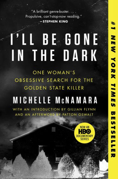
As you can see in the example below, the book cover has two subtitles and a quote about the book from Stephen King.
- Get the typography right
The text you put on the book cover may be the work of a genius, but the wrong typography is a sure way to mediocrity for those brilliant thoughts. A well-chosen typeface can give the text almost as much character as the words themselves. But that’s the last thing on your checklist when choosing your font.
The most important aspect of book cover typography is readability. We can’t stress this enough.
If someone who sees the book for the first time can’t read all the text on the cover at a glance, move on to a different typeface without hesitation. Zoom out or take a few steps back before you fall in love with one to make sure it reads well in thumbnail size too.
Once you have a shortlist of just three or four typefaces, you can play around with font weights, glyphs, swashes, letter spacing, line height, and other fancy stuff that’s way down the rabbit hole. Check out our collection of free typography fonts that may fit your book cover project, or take a look at some free script fonts if you’re after something that resembles handwriting.
Here’s a good example where the typography and the color goes hand in hand with the book’s topic.
- Choose an appropriate color palette
This topic is so complex it could fill not just yet another book, but perhaps a small library. Then again, you don’t need an arts degree to get the basics right.
The most important thing is to stay away from using too many different colors and make conscious choices when selecting those few tones to make sure they match. You can check out some proven color combinations to get inspired.
The color palette for The Martian goes hand in hand perfectly with the book’s theme since it resembles the planet Mars.

- Think about the visuals
The background, as previously mentioned, is a critical design element, regardless of how simple or complex it is. You have many options, but in most cases, it’s best to go with a clean visual that doesn’t steal the focus from the title.
This is not to say you shouldn’t use photos. On the contrary, high-contrast shots are especially impactful, but keep in mind that the busier the background, the more challenging it is to keep the overall design nicely balanced. Far from impossible, though.
If you choose to use a photo, make sure it’s high-resolution, high-quality, and last but not least, you have the right to use it. A copyright lawyer’s name is the last thing you want to see in your fan mail.
When browsing for an image to make a book cover design, ensure it evokes the right mood and causes an emotional reaction, be it calmness, suspense, intrigue, or even fear or disgust as long as it fits the theme.
An alternative would be to go for a minimalist book cover and keep the visual elements at a minimum.
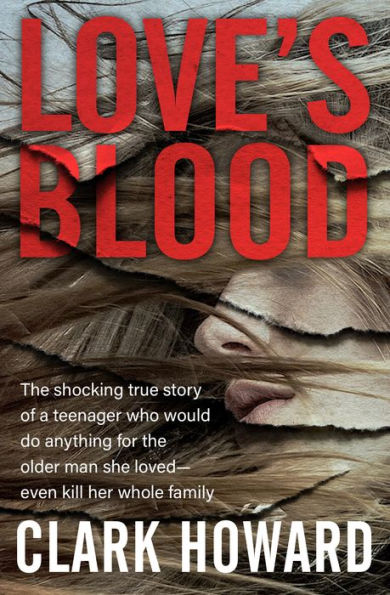
Just by looking at the book cover below, you know that something’s about to go down in that book.

- Look into the size requirements
Depending on where the book will be marketed, you may need several versions of different resolutions and aspect ratios. It might be a good idea to check that your design concept works in all scenarios, and create the master file in a way that it will be painless to adapt it to a new format later.
Here are some of the most popular online stores where you might want to list your book, as well as their book cover size requirements.
| Platform | Format | Cover size requirements | Recommended size |
| Amazon Kindle Direct Publishing | JPG, TIFF | 1000 px min. width (up to 10000 px) | 1600 x 2560 px |
| Barnes & Noble | JPG, PNG | 750 px min. width | 1400 px min. width |
| Apple iBooks | JPG, PNG | 1400 px min. width | 1400 x 1873 px or 1600 x 2400 px |
| Draft 2 Digital | JPG | 1600 x 2400 px | 1600 x 2400 px |
| Kobo Books | JPG, PNG | 1400 px min. width | 1600 x 2400 px |
| Wattpad | JPG, PNG | 512 x 800 px | 512 x 800 px |
| Smashwords | JPG, PNG | 1600 x 2400 px | 1600 x 2400 px |
What a Book Cover Should Do
Before jumping into the technical bits and bolts of how to make book covers, it’s worth looking into the why.
For the sake of relatability, think of the book as a room. If the contents of the book are all that’s inside the room, the cover is the door. It should serve as a gateway between the reader and the book, a two-way channel that on one hand allows the author to address the reader but also gives the reader a peek into the book before opening it.
But for this to work, said door must be inviting and easy to open.
The best book covers give something away to capture attention and raise curiosity. So while a touch of mystery doesn’t hurt, the book cover design shouldn’t leave a few basic questions unanswered:
1. What’s the book’s genre?
This is crucial for marketability because you have to find an appropriate niche for your book, and you want it to fit into it well. From a less technical point of view, basic common sense also dictates to avoid disappointment.
For example, a high-action snapshot may look compelling. Still, if the book is a volume of transcendent contemplations or intricate macramé knots, you’re in for some bad reviews on Amazon. The bottom line is, dissonance is terrible for business.
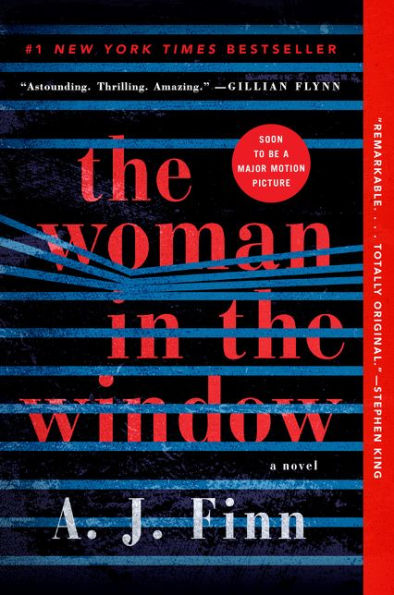
You can see in the example below how the book cover conveys pretty clear the genre of the book—thriller, crime, mystery.
2. Is it unique?
Every book is unique, of course, but so are snowflakes, and you know that without having looked at too many of them. A clever and creative book cover design should aim to highlight not only that yours really is different from the rest, but also hint at why it’s worth a closer look. Without spoilers, of course.
Below, you can see one of my favorite examples of unique book covers that I’ve stumbled upon.
3. What’s the story?
Again, we know you don’t want to give away too much, but you don’t have to. Think of this more as a handhold. If the previous two questions were too difficult to answer in one visual unit, this could be the skeleton to guide your design work, and a reference point for the viewers to better understand what reading experience they should be expecting.
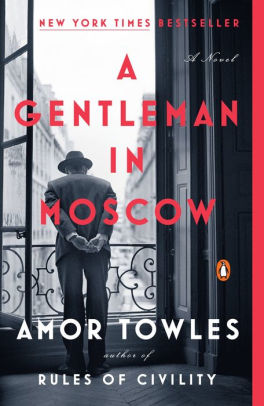
In the example below, you can see how the book cover depicts the story of a man who is sentenced to spend the rest of his life in a luxury hotel.
How to Design a Book Cover in Creatopy
Now that you have the all-important inspiration and the design concept is taking shape, it’s time to get your hands dirty.
In Creatopy, your idea can go from concept to implementation in a short amount of time, even when you have little to no design experience.
We’ll walk you through the entire process, step by step. It’s easier than you’d think. To get started, we recommend exploring our templates first. However, you can also start from scratch.
The result is the same either way because you can transform and personalize the ready-made templates too, down to the smallest detail.
Let’s get started.
1. Choose the book cover size
Log in to your Creatopy account, then from the dashboard, type in the search bar the word “book”, and select the eBook Cover option.
What this does is select the default size for your worksheet, which is 1600 x 2400 pixels for book covers. This is where the book cover design templates become available.
If you need a different size, you can go ahead and click on the search bar, and you’ll see the Create custom size option. However, you won’t be able to access the templates this way.
2. Pick a template or start from scratch
If you went ahead with the default 1600 x 2400 size for your book design, on the left side of your screen, you’d see the templates section. Browse through them to find one you like.
Remember, this is just to speed up your work, so don’t waste too much time hesitating on the small details. You can change or remove anything you see in the templates.
If you selected a custom size or you simply don’t want to use a template, then you can get started with adding your own design elements onto the blank canvas.
3. Personalize your template
This is where you can really let your creativity shine. It’s best to start with the text, so you can set an appropriate size. Remember, it’s essential everything is easy to read while maintaining a logical hierarchy of the different elements.
- Text
You can customize the existing text elements, create others by duplicating them or adding new ones from the sidebar, or just remove the unnecessary ones by selecting them and hitting Delete on your keyboard.
Changing the typeface, its weight, and text size is as easy as clicking on the text element you want to modify and setting the new parameters in the popup menu on the left. You can also add a drop shadow for easier legibility under Color.
Tip: You might find it easier to set the appropriate font size by dragging the corners of the text element.
- Background
Depending on how you use it, the background may be the leading visual element in your design or just a subtle touch. To exploit its versatile nature to the max, you can add simple colors, gradients, many different textures, choose a stock photo or upload one of your own shots.
Once you select your background, there are many different settings to fine-tune your design, all in the left-hand side toolbar.
Tip: Make sure your background goes well with the typefaces you’ve used for the text, or change the text’s layout to make sure everything is in good visual harmony.
- Elements
There are many aspects of a simple book cover template that can inspire your design. In this example, we kept the same typeface and decided to use just a small part of the primary visual element, and completed it with some additional vector graphics from the library.
You can resize and rotate these to your liking, and you can even change their individual colors to work well with your design.
If you want to use multiple elements on top of each other, you might need to change their order to make sure all of them remain visible. Each item has its own layer, and you can reorder them with a simple drag-and-drop in the right-hand side toolbar.
You can also merge more layers into one if you select them and click Group in the popup menu. Lock them into place once you’re happy with their position.
Tip: You can use simple shapes to create layovers, frames, entire backgrounds, or just subtle accents to keep the viewer’s focus where you want it. Here we duplicated the original rectangle from the top to give the subtitle the backdrop it needed to remain easy to read. Elements can work really for children’s book covers.
4. Download your book cover
Step back, admire your work, and once you’re happy with it, you can go ahead and export it in any format you want, such as JPG, PNG, or PDF.
Tip: The platform also allows you to save your work at different compression rates for JPG formats. This could come in handy if you want to share your work with others, as many email clients still don’t support large attachments.
Evaluate Your Book Cover Design
Time to get critical. As much as you may have fallen in love with your own creation, it’s paramount to distance yourself at this point and analyze the result objectively. We know it’s somewhere between difficult and impossible to be impartial towards your own work, so we’ve created a handy checklist to make it easier to spot any imperfections.
Take a step back, squint your eyes, and ask yourself these questions one by one:
- Is the text legible? Can I read it at a glance in thumbnail size?
- Is the design intriguing? Would it make me open the book if I saw it for the first time?
- Is it emotive? Does it evoke the feelings that it should?
- Are the main colors in harmony with each other?
- Does the design fit into the expectations in the genre? Can it be easily mistaken for something else?
- Does the book cover represent the author’s style and previous works?
If the answer to all these questions is a clear and confident YES, it means that you can either pat yourself on the back for creating a book cover from scratch, or that you’re too biased to think like a reader.
There’s absolutely nothing wrong with the latter as long as you’re open to admitting it, but in any case, give this checklist and a copy of your book cover design to your publisher, a walker-by, a friend, or an enemy, and collect their precious feedback.
To give your criticism-muscles some exercise, feel free to treat the masterpiece we created for the demo as your punching bag. It’s perfect for this purpose as it has a lot of rough edges, and we even sneaked in some basic mistakes deliberately (ahem, sure).

Conclusion
Until recently, not too many people knew how to make a book cover that’s appealing. It still requires balanced teamwork of editorial, production, marketing, sales and other industry professionals to shape a manuscript into a published work.
Still, the easy-to-use online solutions make it possible to take efficient, no-compromise shortcuts when it comes to designing book covers.
Whether you’re the author or any other link in this long chain that brings books from an idea all the way to the bookshelves, today you can take book cover design into your own hands.
All you need is a concept that’s a good fit for the book and gets the readers curious enough to turn the all-important first page. As a last bit of advice, remember the room analogy—it might be a good idea to leave that door slightly cracked open. After all, the point is to encourage readers to open it and step in without too much hesitation.
We hope you have found this quick guide useful, and that it’s given you a boost of courage and motivation to have a crack at it and create your own book cover online.


One of the best tricks that works while creating an awesome book cover is to highlight a single element. The highlighted element will dominate the entire design and will catch readers’ eye.