Our everyday life means constantly interacting with different objects, which resemble various shapes, from basic to abstract ones.
What’s interesting about shapes is that they can make us feel a certain way. This means that, no matter if you manually create graphic design materials or if you want to use AI to create ads, you can use different shapes to evoke particular emotions.
A powerful communication strategy is all about pairing the right message with a great design to achieve the desired results.
In this article, we’re going to talk about the psychology behind geometric shapes, how all the objects surrounding us can be associated with basic shapes, what are the main shape meanings, and how you can use them to influence your visual marketing strategy.
What Are Geometric Shapes?
In graphic design, shapes are two-dimensional figures in a layout with clear delimitations at the edges. By adding a third dimension to them, you can create forms, which is a different element altogether.
Most of the shapes rely on cultural conventions or nature silhouettes, which makes them familiar to us.
They can work as a standalone design if you need to send a direct message. Otherwise, they work as an accessory, for various visual marketing materials such as presentations, infographics, or social media visuals.
But what’s the best shape you can use to send the right message?
3 Types of Shapes in Design
Sometimes the best way to create a compelling design means reducing it to its most basic shapes. Simplicity may be the answer.
There are three main shapes you can use in your designs:
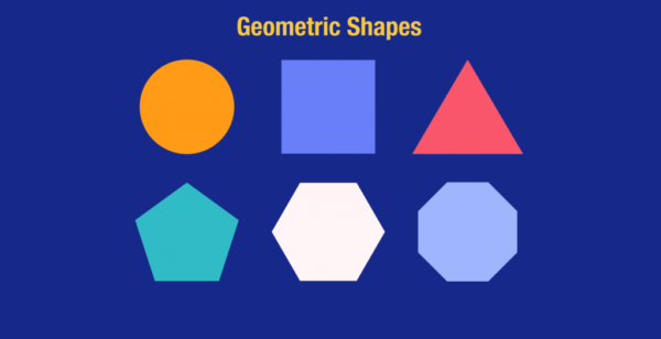
1. Geometric Shapes
Probably the most commonly used, the geometric shapes come first to our minds. Circles, squares, triangles, pentagons, hexagons, or octagons are instantly recognizable.
They are so familiar to us because we started seeing and drawing them since we were kids. In kindergarten, we learned shapes through play before we learned about letters, so it’s only natural to feel acquainted and drawn to something we’re used to.
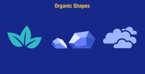
2. Organic Shapes
Opposite to geometric shapes, these are asymmetrical, or imperfect but necessary and comforting shapes encountered in nature.
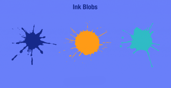
Everything that was created naturally can fall into this category, such as leaves, rocks, or clouds. Rarely, these shapes can be human-made, like ink blobs.
3. Abstract Shapes
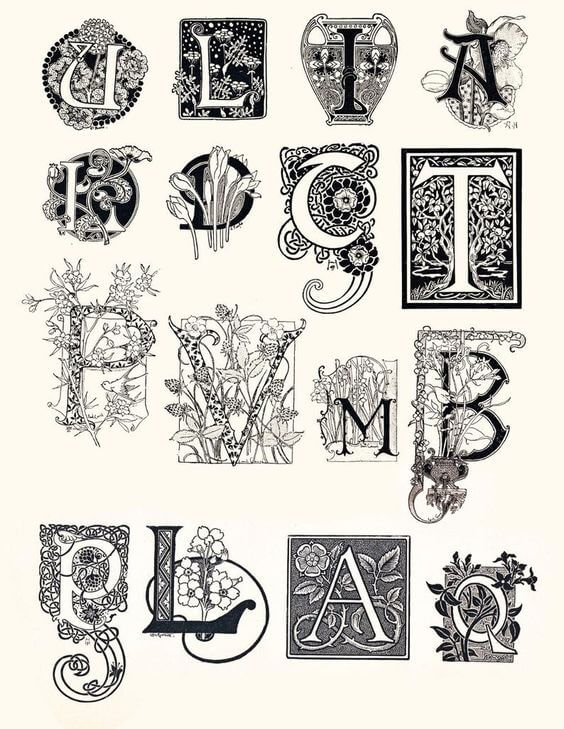
These illustrate organic forms or everyday objects, even though they are not an exact representation. For example, a stick figure is an abstract shape depicting a person, or typographic glyphs can illustrate letters.
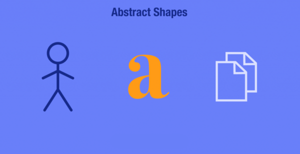
Symbols that you see and use in your everyday life, such as mobile app icons, can be placed in this category.
Now, let’s dive deeper into shape meanings and learn how you can integrate them into your visual communication strategy.
The Psychology of Shapes in Design
Designers use shapes to express different ideas, create the notion of movement, offer texture and depth to an image, suggest a mood or emotion, or emphasize an area of interest.
Most of the time, the designs will get paired with a color. The combination of shapes and colors are various and hold different meanings and moods.
Before deciding which one to choose, you’ll need to understand your design’s purpose and the message you want to convey.
Specific shapes and colors already have meaning in our minds. This usually applies to the familiar shapes which have associations with objects encountered in nature.
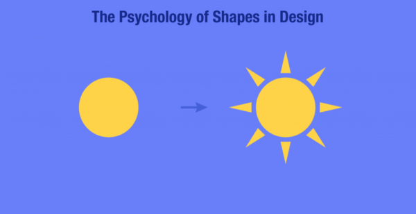
So, when we see an object reduced to a combination of color and shape—let’s say a yellow circle, symbolizing the sun—we’ll instantly recognize it.
Sometimes, if we don’t immediately identify them, their meanings can be more in-depth, and they only send a specific feeling by not giving all the information.
It’s time to see which are the meanings they carry.
1. The Meaning of Geometrical Shapes
They are the basics of design and also of learning through play. Most of us played the game where you had to match shapes of different colors.
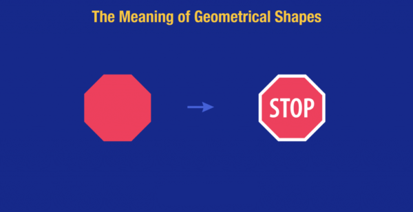
There are specific connotations to every shape, and usually, these meanings are cultural. When we see a red octagon, we know it means STOP.
From an early stage, the human mind finds a way to fathom all the geometric meanings because it understood shapes before it understood language.
Going from learning through play to designing through shapes, we can see that there is a tendency towards simplicity and minimalism in almost any type of design.
The simplicity is so appealing to everyone because, with the right shape and color, you can send a more powerful message than through lots of rich details.
Applying different characteristics to shape in graphic design, you’ll convey different moods and meanings.
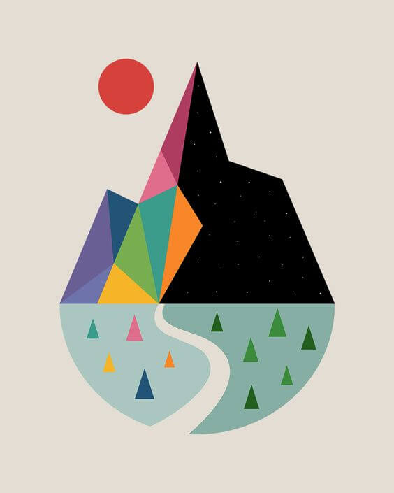
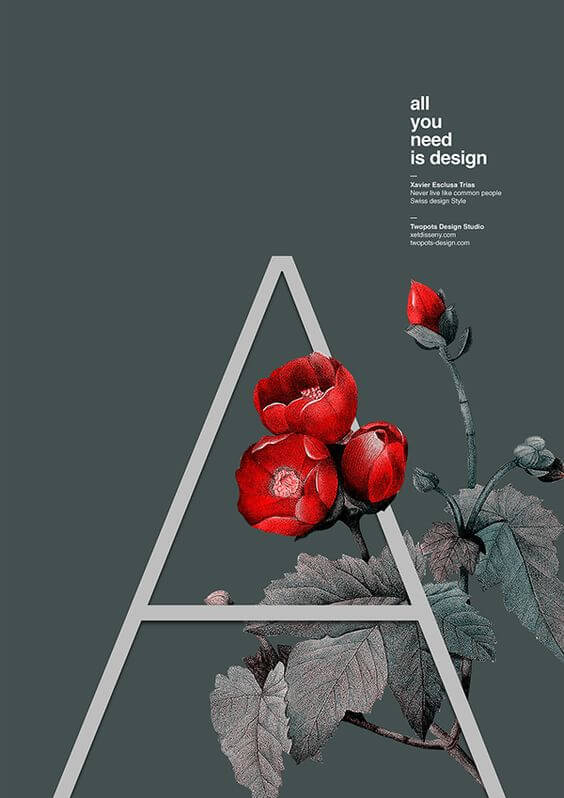
By understanding the geometry meanings, you can even create art with geometric shapes.
Something like this:
Let’s skim through the most common shapes and geometric meanings:
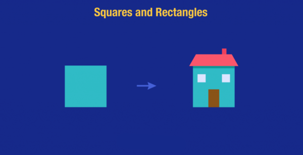
- Squares and rectangles
Square geometric shapes are the most commonly encountered. These shapes are familiar to the eye, and it’s easy to use them as a frame or as a base for designs. Because these shapes aren’t usually the focus of a visual, they are used to give a sense of stability. The angles suggest a mathematical order.
Squares and rectangles suggest peacefulness, security, and a sense of conformity. When we draw a house, we start with a square.
Sometimes, we may think that squares or rectangles are bland shapes that don’t get noticed, but with the right strategy, they can be as effective as any other shape.
To make a visual stand out with these shapes, you may consider an old-school pixelated form of design, meaning lots of squares put together. Like this:
![]()
![]()
Image Source: Instagram
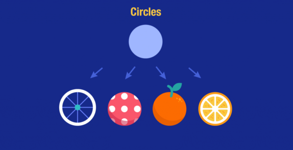
- Circles
Circle geometric shapes represent continuity, the eternal whole because they have no beginning or end. In every culture, circles illustrate the sun, the earth, the moon, and other celestial objects.
Their completeness suggests harmony, warmth, and gives us a sense of calm. Circles also help us portray movement in visuals and are used to indicate familiar objects like wheels, balls, or different fruits, like oranges and grapefruits.
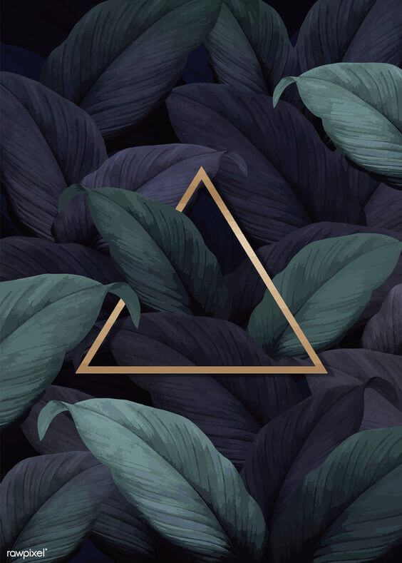
- Triangles
Triangle geometric shapes can show stability and power when pointing up or instability and conflict when facing down.
They hold energy like no other shape and can symbolize the spiritual trinity with the union of body, mind, and spirit. They can also illustrate self-discovery.
There are other triangle shape meanings in graphic design, such as dynamism and improvement.
When choosing this shape, it’s always better to use it sitting on its base, or with the point facing right, to suggest the forward movement. Otherwise, it may send negative vibes, as the Western culture believes.
A few examples from the digital world that symbolize the movement through triangles are the play symbol, fast forward, or reverse symbols, which have the triangle shape.
![]()
![]()
![]()
![]()
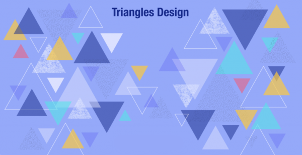
Triangles can be used to suggest familiar forms like pyramids, mountains, or pennants. If the triangle is skinny, it portrays an arrow.
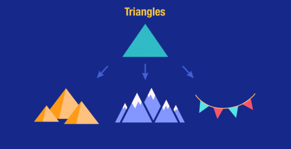
Small triangles design can be used as a mosaic or overlapping each other to create a powerful sense of unity.
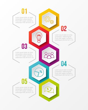
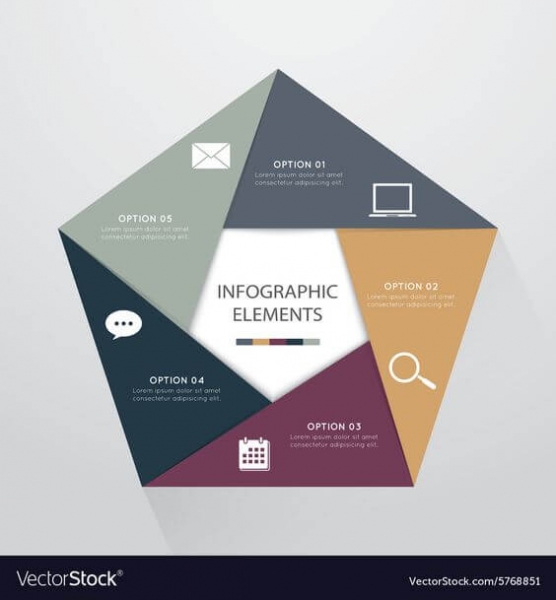
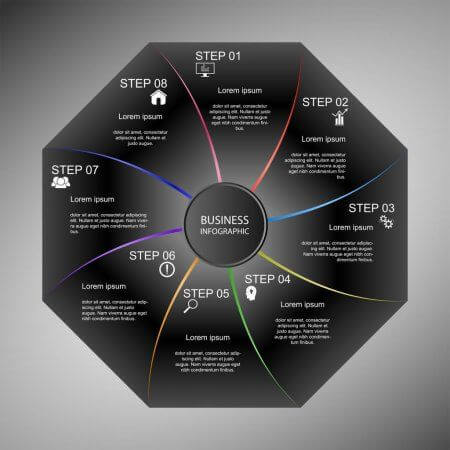
- Pentagons, hexagons, and octagons
Among the polygon shapes with more than four sides used in design, pentagons, hexagons, and octagons are the most common. These shapes are part of our everyday life, and we are so used to them that we can immediately associate a shape with a symbol.
For example, The Pentagon Building in the US (pentagon shape), floor tiles, or sections of a beehive (hexagon shapes), the stop sign, or an open umbrella (octagon shapes) are easily recognizable.
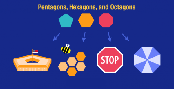
All of these shapes can be used as a puzzle and create infographics, as they offer a professional look and feel.
2. The meaning of organic shapes
Natural or organic shapes are objects or animals encountered in our world, such as leaves, flowers, or trees. They can also be human-made things like ink blobs.
These shapes will help you create designs related to the environment or campaigns for outdoor activities.

The natural shapes can work both as accessories in your visuals, and on their own, as they send a precise message, with no hidden meanings.
Besides these characteristics, organic shapes can be highly decorative.
There was a time when a decorative art style called Art Nouveau absolutely flourished. It was focused on organic shapes, especially flowers, which were applied almost everywhere—architecture, painting, and even lettering.
Influenced by Art Nouveau, the hippie period expressed their beliefs through flowers and other symbols, all of them illustrating peace.
So, the thing is, if your message aligns with the organic shapes, and you can get the desired outcome by using them, these are a fantastic option to consider.
3. The meaning of abstract shapes
When we say abstract shapes, we usually refer to symbols or icons, which carry different meanings.
Use abstract shapes only to emphasize an idea in your visual, or infographics. When used alone or in a large quantity, they can be confusing to your audience.
In infographics, symbols can sometimes replace text when you need to emphasize an idea so you can put a star symbol next to the message you want to highlight.
Keeping the same colors of the symbols throughout your graphic will show consistency and will help you direct the focus on the fundamental ideas.
The most used symbols and abstract shapes are:
- Arrows
Arrows are pretty versatile, and they can be used in lots of different situations to send specific information. When you make them bold, they can send a more powerful message or, if they are thin, they work great for a bullet list.
Probably the most crucial aspect of an arrow is its function of showing direction. Thanks to this, the viewer will know where to look in your graphic and what to read first.
![]()
![]()
Arrows also have a decorative function. If you want to create a poster with boho vibes, you can place such arrows on it:
![]()
![]()
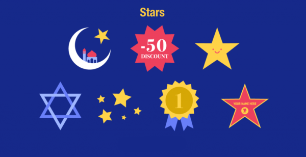
- Stars
Stars can be seen as symbols, besides geometric shapes, since they are often used in religious illustrations. Moreover, they usually show the importance of something, and they always succeed in getting people’s attention.
Stars are some of the best shapes you can use to draw your audience’s attention towards an ongoing promotion or discount code.
Usually, we tend to use yellow stars to get people’s attention, but there are also stars with blue ribbons, which represent getting first place in a contest.
Stars are a great way to give kudos to someone, and it can go from a small golden sticker to a star on Hollywood’s Walk of fame to show tremendous recognition.
- Icons
These are considered accessories to any design, and it’s better that you use small icons in your visuals. They’re not the focus of your message but may prove essential to have.
Icons can be used in both print and digital designs, but more likely, you’ll find them on digital platforms because they may act as a call to action button.
![]()
![]()
They can also be used to organize your visuals and break the content into categories. Take a look at this example:
![]()
![]()
Another cool idea is to use Instagram story highlight icons, which can help you make a great first impression.
If you need a constant and reliable source, Creatopy offers you 20 categories of different icons that will help you organize your visual communication.
The Best Tips and Tricks When Mixing and Matching Geometric Shapes
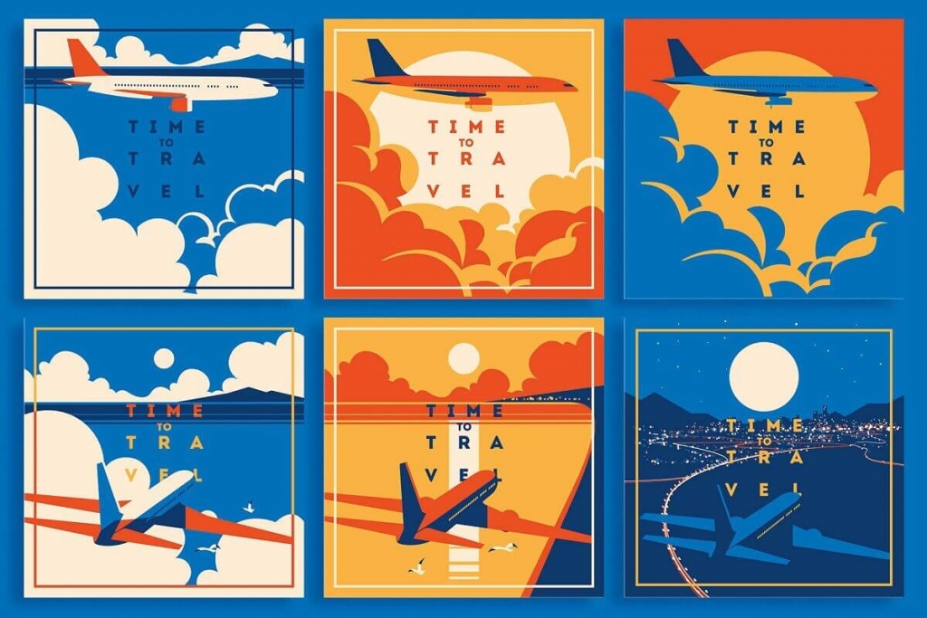
For an aesthetically pleasing design that proved to be highly effective (I saw this combination a lot), you can combine geometric and organic shapes. The result will look something like this:
So, you either use one category of shapes in a visual or combine them and get to meet the organic with human-made elements. You can use a combination of shapes from different categories, almost everywhere. The basic rule is to understand shapes symbolism.
Here are some examples:
- On landing pages
You can combine abstract shapes with organic shapes and get something creative that will catch your site’s visitors’ attention.
- On posters
Don’t let your posters go unnoticed. Use abstract shapes with organic shapes, add the right copy, and the colors that will emphasize your message, and you’ll see it’s going to be a successful strategy.
Or you can just create amazing posters using the geometric shapes’ precision with the natural organic shapes that will soften the message, giving it that extra something at the same time.
- On icons
Your geometric shapes can symbolically hold life inside them if you combine them with natural, organic shapes.
![]()
![]()
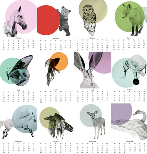
- On calendars
Add natural elements to your circles’ graphic design, and you’ll never have a boring calendar ever again.
- In a visual story
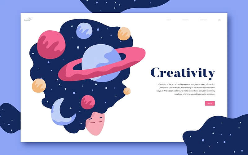
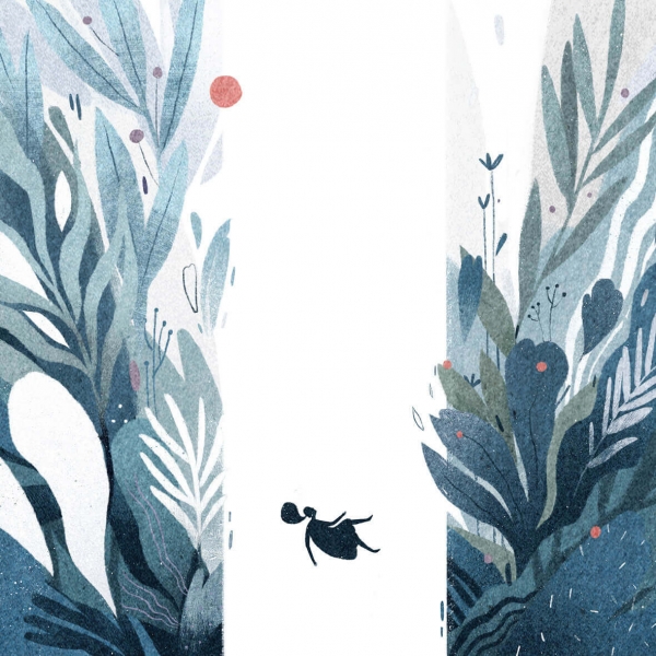
It’s perfect to use organic shapes to express yourself because they carry different feelings and moods, depending on the colors you use on them.
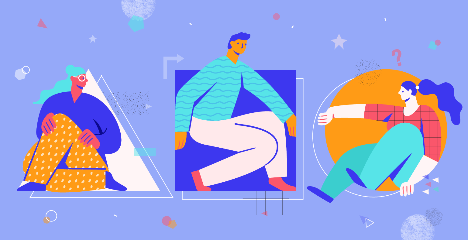
In the following visual, they seem to guide their protagonist; that is, the abstract shape of a girl falling deeper and deeper inside her dreams or imagination.
After seeing the main shapes, their meaning, and a few ways to blend them, let’s see yet another essential functionality they carry, which is their use in logo design.
Now, we’ll go through some of the most essential logo shapes and their meanings.
The Psychology of Shapes in Logo Design
A logo design is part of the brand identity, and it’s how you introduce yourself to potential customers. With a well-crafted logo, you’ll get the attention of the target audience.
In fact, the Journal of Consumer Research shows us that even the basic shape of a logo can be enough to influence how people perceive your products and services.
The psychology of logo shapes in graphic design shows us how changing the shape of a logo can alter customers’ entire perception about a brand.
It’s imperative to take this into consideration when designing your logo, because once it’s out there, it will send a message to your audience, and you want to make sure it’s the right one.
So, how can you use shapes the right way when designing a logo? Let’s take a look at some of the most popular logo shapes and analyze them.
Circle logos
Circles are commonly used in logo design because they are softer and offer a sense of calm rather than shapes with rough edges.
Because they don’t have lines with any sudden change in direction, your brand’s first impression upon the world will appear reliable.
The message circles send is emotional. It shows unity, commitment, and steadiness because of their shape, which makes us think of infinity. Branding experts use this shape the most because of their familiarity and meaning of eternal balance.
Only round shapes appear naturally. We don’t usually see a perfect rectangle in nature. Designers from every field use this familiarity.
![]()
![]()
Square logos
Squares are used to illustrate proportion, balance, professionalism, and strength.
Because of their shape that shows stability, a square or a rectangle can inspire trust and safety for your target audience.
When choosing a square for your logo, it’s better to pair it with colors. Remember how I said squares can seem bland? Avoid that from the beginning and give stability a sense of playfulness too.
Here are some examples of famous square logos:
Most of them are colored, but there’s also BBC or Cartoon Network that chose to go for black and white.
Although they made this choice, it aligns with the brand’s identity. BBC needed to seem serious and reliable, and Cartoon Network’s black and white checkered pattern is a staple and almost synonymous with animated content.
Triangle logos
Triangles may not be so commonly encountered, because they work for particular niches. They can inspire ideas such as dynamic power or continuous motion.
Because their shape can show direction, triangles have energy like no other shapes. This is why some people may perceive them as unstable and insecure.
On the other hand, triangles show innovation and fast improvement, which means they’re a perfect choice for tech companies.
If you end up choosing a triangle as the shape of your brand’s logo, make sure it’s facing upwards, or at least in the right direction. When facing down, it may indicate instability and negative connotations.
Like in the logo for Guess, although even the co-founder of the brand, Paul Marciano, said there’s no deeper meaning behind the logo, its name side with the downwards triangle gives a sense of questioning.
![]()
![]()
Having sharp edges, the triangle logo shape is mostly used in construction, motor, scientific, or tech industries.
Like in the logo for Google Play:
![]()
![]()
YouTube:
![]()
![]()
Or Mitsubishi:
![]()
![]()
Organic Logos
You can probably think of a few organic shape logos. Brands often choose to design their logo being influenced by a natural shape because these give a feeling of familiarity, and it’s easy to relate to them.
The audience will get to easily connect the natural shape, which is something that they see or frequently use with the brand’s identity.
Moreover, it goes the other way around too. When seeing a shape in your daily environment, you think of the brand it represents.
![]()
![]()
![]()
![]()
Before you begin working on your logo project, it’s essential to understand the message and characteristics the logo will convey.
After you know what the key message you want to send through your logo is, you’ll be able to pair it with colors and some cool fonts.
Conclusion
Geometric shapes are more potent than you’d think. Through them, you can easily convey certain emotions and feelings. The key is to know what types of shapes can help you achieve your goal and use them accordingly in your designs.
As you’ve seen, they can be successfully used in logo design as well, but you need to be very careful what you decide to go for.
Basically, everything in this world can be simplified and brought to a simple shape. If you manage to master the basics of shapes, you’ll get the cubist out of you.
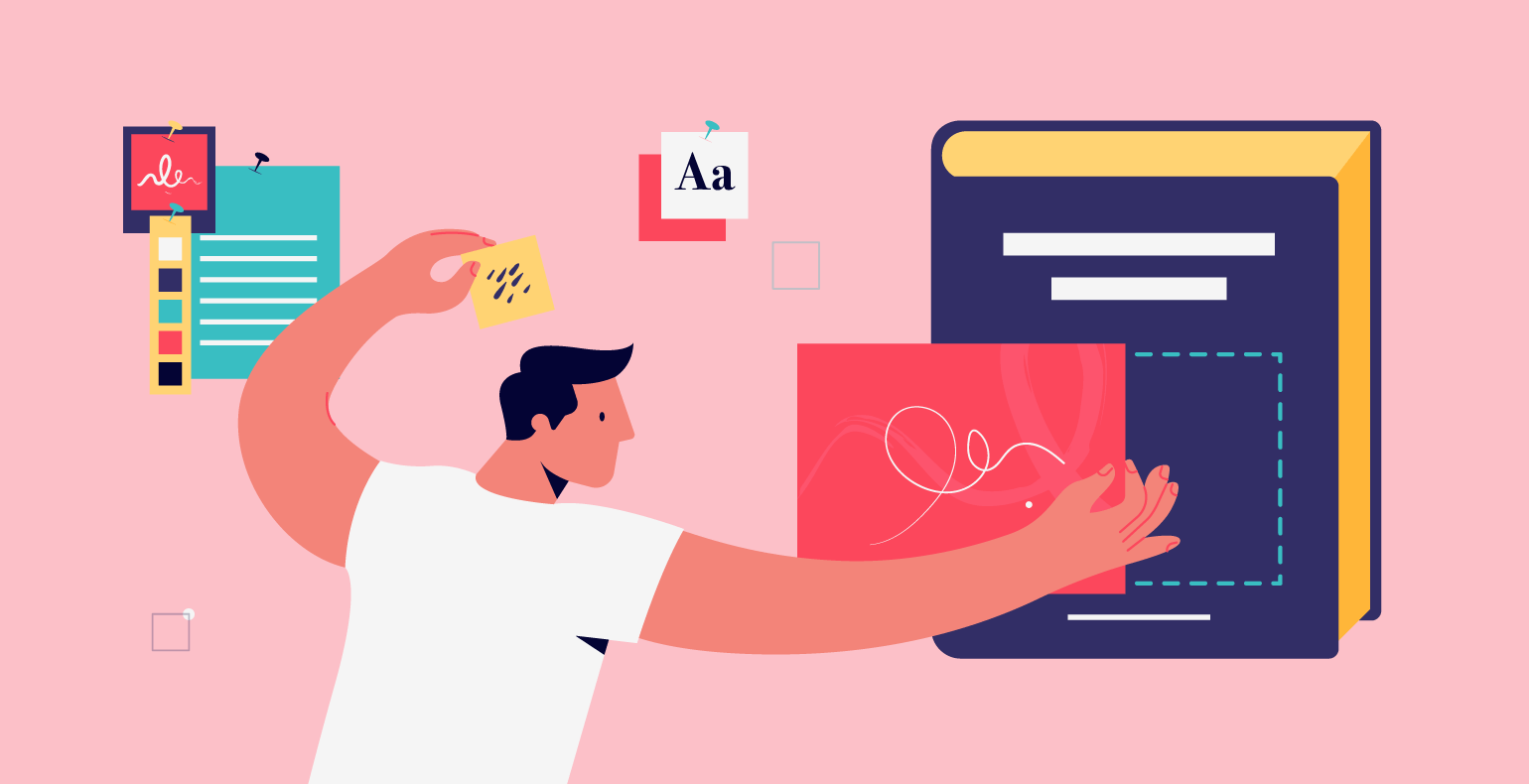
Now it’s time for you to put into practice what you’ve learned today. Log in to your Creatopy account, let your imagination flow, and create something stunning out of geometric shapes.


Found this page accidentally and was pleasantly surprised in what I learnt about shapes as a quilter. Wonderful. Thank you.