


Typography animations have been extremely popular for many years, and we can see them everywhere from movie openings to tv commercials. They have also been widely adopted by web designers and used massively in website design and display banner design.
The reason why kinetic type is so loved by designers is that it provides endless creative possibilities, it’s eye-catching and it can convey powerful messages.

What is animated typography?
Kinetic typography or animated typography, refers to any kind of moving text, be that text that moves slowly, expands, shrinks, or morphs into something else. Animated letters are way more attractive than static text.
Text animations are used to:
- Emphasize the meaning of a text and
- To convey an emotion-filled message.
- It also has the potential to catch a viewer’s attention and impact him in a big way.
And now, I invite you to go through a selection of cool typography animations. Each of them is a great opportunity for you to learn some new techniques and discover amazing creative ideas. Some of them might dazzle you!
10 examples of amazing animated typography
1. Morphing is one of the most used techniques in kinetic typography to create motion typography. It is simple and eye-catching. Besides, it can help designers promote an important message or make a statement.

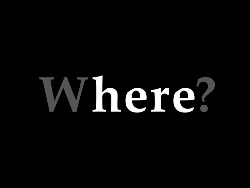
2. Flickering text, on the contrary, is not something you’ll find very often. One really needs to have a flair for picking words in order to use flickering as animated text. Not many words out there work as well with this technique, as “where” and “here” do.
3.Hypnotizing text will never go unnoticed. It’s meant to stand out and impress. And mesmerize.

4.Moving text, either it’s from right to left or up to down, is spectacular also, especially when the technique is paired with appropriate words. As you see in this example, this animation effect was used to emphasize the meaning of the words and surprise the viewer.


Artist: Siddhart Mate
5. Drawing the text letter by letter is not something new, but it all depends on how you do it, what fonts you use and other complementary graphic elements. This example shows just how creative one can get with a simple message like “silence of a forest”. On the one hand, the artist used this foresty green, on the other, it made the word “forest” actually look like a pine forest! And not to mention the subtle little leaf falling on top of “i”!


Artist: Chesca Acpal
6.Geometric constructions are the new sensation of animated typography. This type animation technique is modern and cool and it can help creatives promote a tech or urban brand like no other.


Source: Animography
7.Fluid geometry is a new kind of typography animation technique and it’s splendid! It has an urban air and a fluid dynamism.
Source: Animography
8. You may have never heard of texture constructions, but they do exist. Here’s the proof:
This animation technique constructs the layers and texture of letters simultaneously for a truly artistic effect.

Source: Animography
9. Complex morphing is another way to get attention to your message. I love how these symbols of London create the name of the city. You can even recognize each individual building!
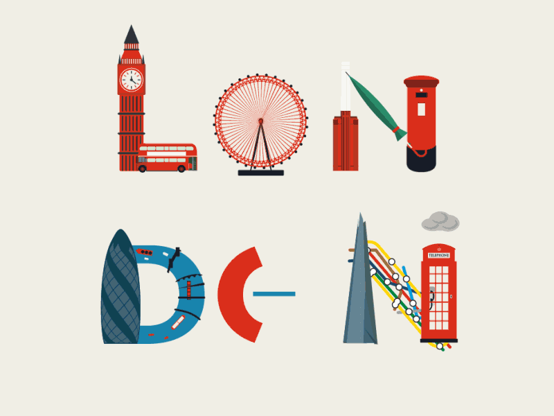
Source: Giphy
- Graphic animations include the presence of graphics and illustrations. This is a more complex type of animated text but it is totally worth it.

Source: Giphy
11. The dynamic montage of text can tell a story, even when there are no images at all. Pause for a moment and take a look at the example below to understand how timing, pause and the abrupt apparition of text can create thrill and a storyline.

Source: Contentcreatures
12. Neon flickering is used quite frequently in ads for pubs and bars. The effect is extremely easy to create and it guarantees your message will get noticed.
Artist: Margaret Fu
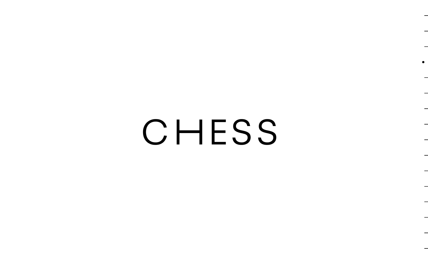
13. Dash typography is modern and simple and it can introduce a message in an elegant way.
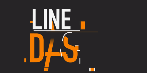

Source: Gifer
14. Creative letters can take everyone by surprise. Just look at this flying bat W. The bat is totally a Halloween trademark, so the association between the two comes naturally.
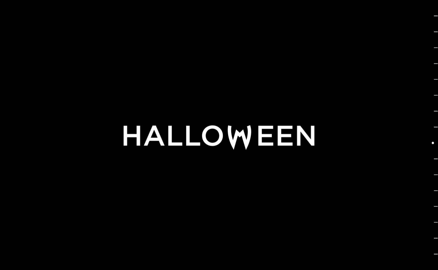

Source: Digital Synopsis
15. Illustrated letters that form a word have been around for many years, but they’re still catchy and surprising.
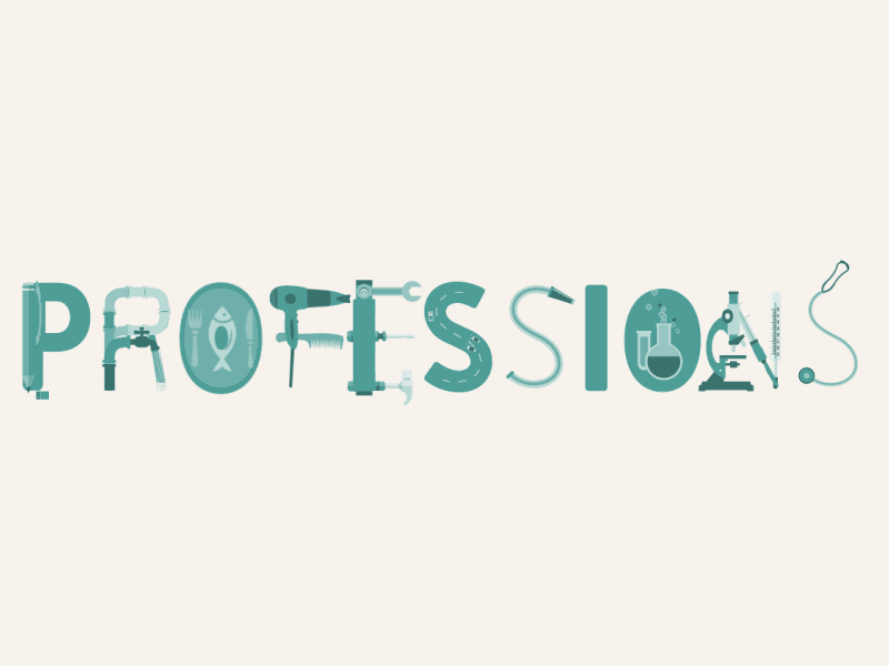
Source: Hackernoon
16. The scrabble effect typography animation can help you create your message in a dynamic and surprising way.
Artist: Maxym Zacharyack
17. Morphing geometric shapes can emphasize your story and create a unique atmosphere.
Source: MVDC Project
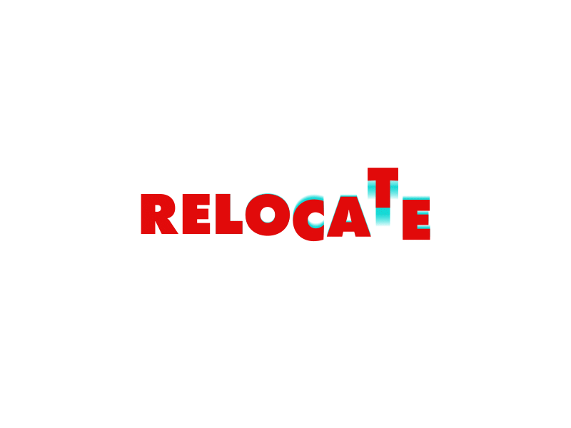
18. Creative animated letters in static words, that’s something no one expects. This combination of static and animated letters is really interesting because you can focus your message on one letter only.

Artist: Mindaugas Dudenas
19. Accelerated typography animation are used to create a dazzling visual effect and to convey a quick story. As we can see in this example, this animation talks about how many tequila shots someone drank. Makes you a bit dizzy.
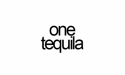

Source: Giphy
20. Emotion-filled animated letters. This isn’t quite an animation effect, but rather a creative technique. This shaking “i” conveys so much emotion, we can almost empathize with it!
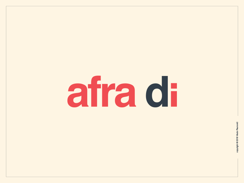
Artist: Vlado Paunovic
How to create your own cool typography animations
Eager to try and create a cool typography animation? In Creatopy you can create one in just a few minutes. Here’s one I created in about 5 minutes:
Curious? If you want to create a kinetic typography visual right now in Creatopy, sign in to your account (or sign up for free) and follow these steps:
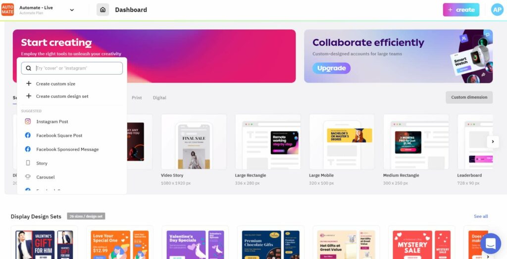
- Go to Create and click the button, or simply select your desired size from the search tab.

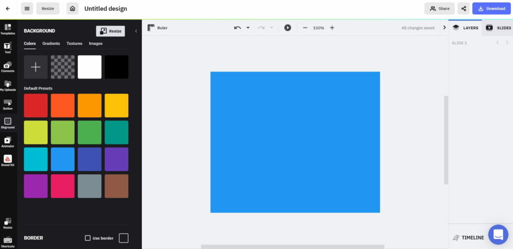
- Select a background for your visual. It can either be a color, texture, pattern, or stock photo, already available in Creatopy. Or you can upload a picture of your own. I’ll illustrate the process using the blue background I choose for my visual.

- Then, add your text. Go to the menu on the left-hand side and click the Text tab. Select one of the available text sizes available, or choose a predefined typography template and just replace the existing text with your own.
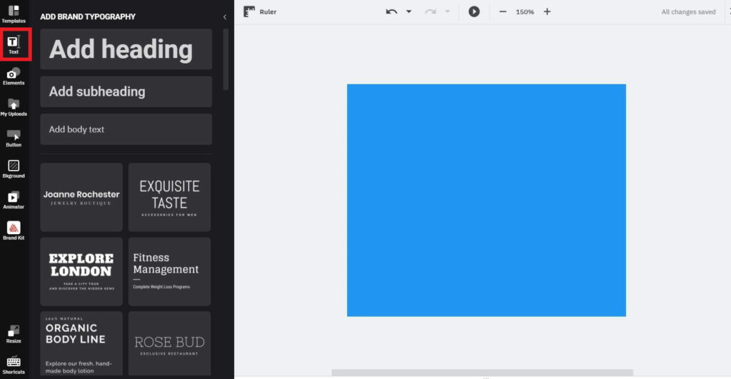

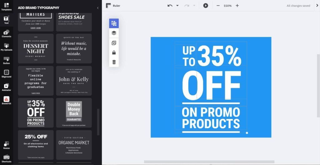
Here is the typography preset I choose. It is standard static, but you can easily animate it. I’ll show you how.

-
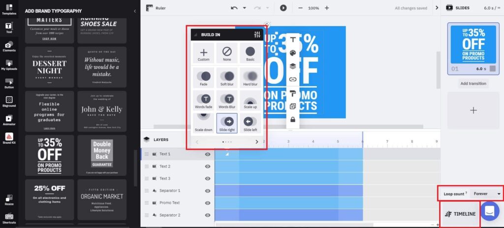
- You can create a quick animated effect using our Magic Animator tool that’s on the menu bar, last on the list. However, if you want to create a surprising and more eye-catching effect, you’ll have to customize each of your words using the Timeline view.
Click the Timeline button, to enable the Timeline view so you can see all of your elements nicely layered and organized.
Then, click on each tiny box at the beginning of each text layer and you’ll see a pop-up menu of the built-in animations available. Try each of them out to see which one works best with your text and then set the duration of the animation effect by simply dragging the right margins of the box to the right.

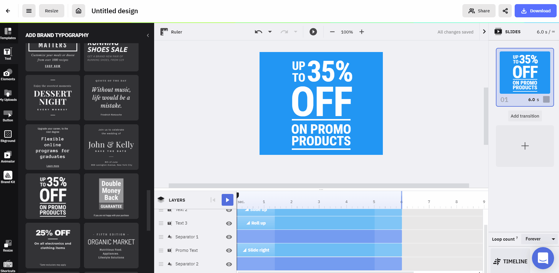
Repeat this action for each of the words in your visual.
For a continuous animated effect, change the looping setting from once to forever or to as many times as you’d like the animation to play.
Then, hit the Play button which is on top of the dashboard to check on your work.

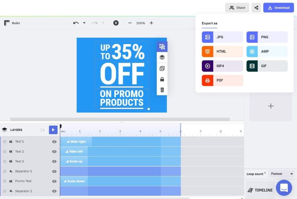
- Now that you’ve finished animating your text, you can download your work in HTML, AMP, MP4, and GIF format.

That’s it! Nice and easy.
Make your words come to life with motion typography!
Now you know more about typography animations and hopefully, you feel more confident to start your animated typography project. Whether you’re trying to create an advertising visual or a DIY promotional material for your blog, Creatopy can help you to design impressively animated texts in minutes!
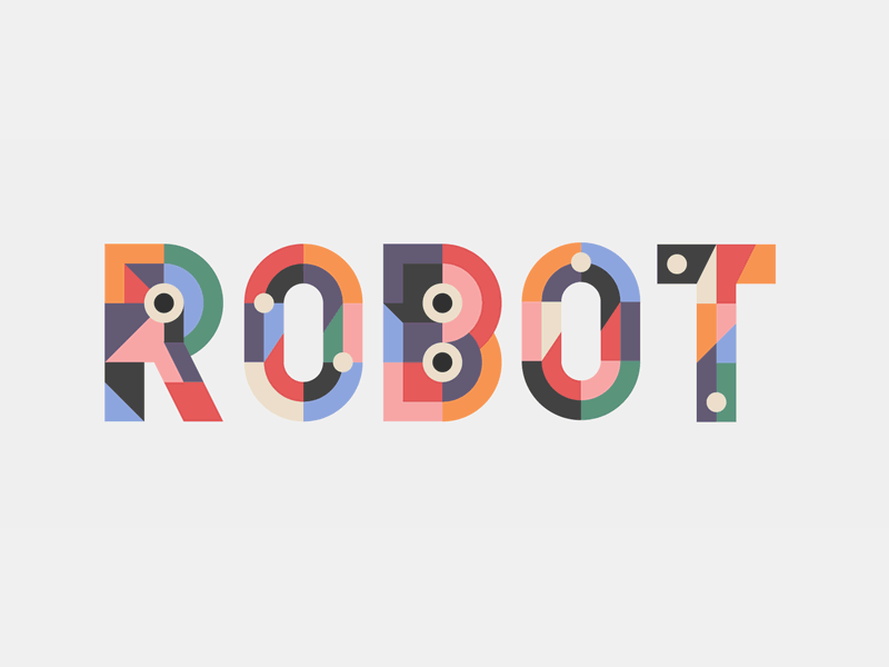
Illustration by Anita Molnar