
It’s easy to lose track of time when you’re feeling inspired and start getting absorbed into the process of creation.
But it can be a trap, especially when you’re on a deadline.
I think we can all agree that creating your own lines and arrows from scratch in InDesign or Illustrator, eats up a lot of time that we, designers, often don’t have.
And why even bother to do it if there’s a quicker way to get the job done?
We recently just released a new feature that’s going to help you save time so you can focus your creative energy on your next big idea.
In the Creatopy Elements section, there’s a new category named Lines, where you’ll be able to find 80 new end-to-end scalable, flexible lines and arrows.
These basic, yet versatile elements, are perfect to use whenever you want to make your designs stand out or emphasize a message.
That being said, you’ll focus on achieving more with less effort.
To jumpstart your inspiration, here are some examples of designs using lines that can get your creative juices flowing.
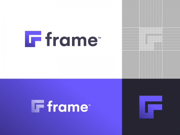
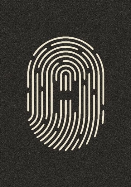
1. Design a Logo From Scratch
Using lines in design is as complicated as you make it.
But why would you, when a simple combination of straight lines, can be so effective in its modesty?
You can employ your straight-line design art to significant effect even without, well, thinking outside the box.
This is a prime example that you can use one of the most simple design elements, the humble straight line, inside a square to create something as impactful and versatile as a logo, arguably the most important visual element of any brand.
Play around with different lengths and thicknesses, create various shapes, but keep in mind, in line graphic design, simplicity is the ultimate sophistication.
![]()
![]()
Source: skolanlar.nu
![]()
![]()
![]()
![]()
![]()
![]()
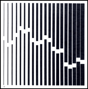
2. Grab a Familiar Shape and Give It a Twist
You don’t have to reinvent the wheel to come up with something that makes people look twice.
On the contrary, if you use familiar lines to tell a story, you have better chances of grabbing your audience’s attention and create something that resonates with them at first sight.
This particular example of lines in graphic design tells an entire story. Despite being based on something everyone’s seen a million times before, it’s full of originality. It achieves this by merely moving one line slightly off-center.
Now that’s what I call working smart!
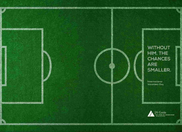

Source: sdmarketingservices.com
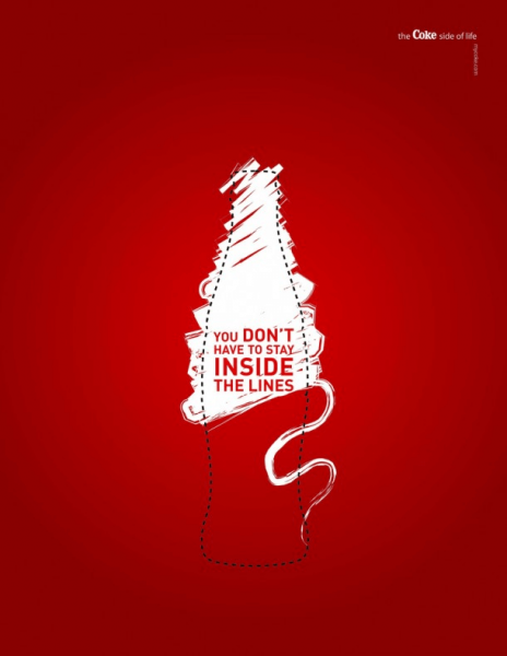
3. Use Negative Space
This sounded like something Darth Vader would say.
But let’s be honest—if he started giving you design tips, you’d probably take them, even if only out of sheer terror. However, there’s a better reason to be more conscious of the empty space you leave between lines in a design.
Our brains are programmed to see lines and shapes, even where there aren’t any.
If you find the sweet spot in your design where your mind starts filling in the gaps on its own, you’ve got a truly unique effect that captivates anyone who looks at it.
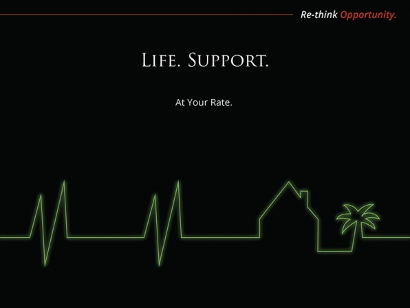
4. Get Inspired by the Product
With any creative work, the hard part is getting the inspiration. And meeting the deadline, but that’s also because inspiration tends to arrive fashionably late.
Looking at an object as a clump of different lines may sometimes jog your creativity and give you some ideas you can test out.
Whether it’s dead-straight lines, curved lines, or zig zags, or if they’re parallel, perpendicular, symmetrical, of uniform or varied thicknesses, there’s almost always something that’s either already iconic or can be made iconic by exaggerating it or placing it in the spotlight.
Of course, there’s also the odd case when the shape of the product is not much help. Even then, looking beyond the packaging and focusing on the benefits of using the product may get the ball rolling.
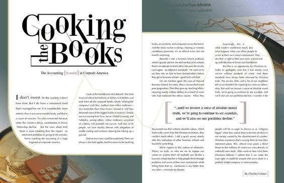
5. Take Your Documents to the Next Level
Who says a text document should be boring to look at?
How about presentations—you don’t want anyone to fall asleep, do you?
Underlines, header and footer separators, and the horizontal line design are the most common uses in layout design, but that’s far from all.
You can brighten up even large amounts of text with creative headings if you go beyond the limitations of the font and extend, say, the serifs or other lines that you feel would give your design more visual appeal.
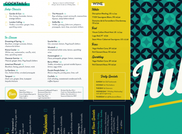
If you use the right amount and the right kind of line work, combined with some clever layout editing, you can even get away with just that. This can successfully work for a restaurant menu.
No need for illustrations and other heavier design elements. Sometimes, just a subtle frame is enough to give your work the structure it needs to be easy to read.
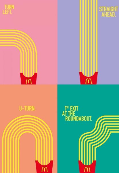
Bonus Tip: Lead the Eye with Arrows
There are too many clever uses of line in design to count, even if we only wanted to cover the basics, but we can’t wrap this list up without mentioning arrows.
It’s a mystery how a straight line with a pointy end can instantly grab our eyes and tell them to “follow,” but in all fairness, it’s not even important.
What is essential, on the other hand, is that we don’t forget about this power and use it to your advantage when designing.
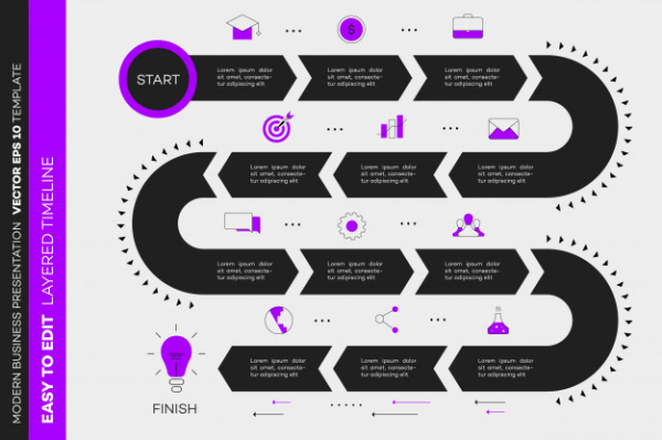
Arrows are your best friend whenever you want to simplify and give your design a sense of direction or motion.
Whether it’s a complex roadmap on an infographic or a step-by-step guide that has to be quick to understand and easy to follow, you can always rely on arrows.
Conclusion
We hope you found these line design examples useful, inspiring, and you have a better idea of how you can incorporate these versatile elements in your future designs.
Already have an idea? Why don’t you sketch it up while it’s fresh?
Sign in to your Creatopy account, go to the Elements section, and start playing with the lines and arrows.
Let your imagination loose, start experimenting with line design. You can use these elements freely, whether it’s infographics, mind maps, flows, routings, connections, or separators you need for your next project.


Good information for graphic designers
Happy to help!
Amazing tips for graphic designers. Thank you so much.
Graphic designers will benefit greatly from these suggestions. Thank you very much for your help.
Great information for graphic designers. Really Thank you